W+H COMMUNITY HOMEPAGE
Homepage Re-design Mockups
OVERVIEW
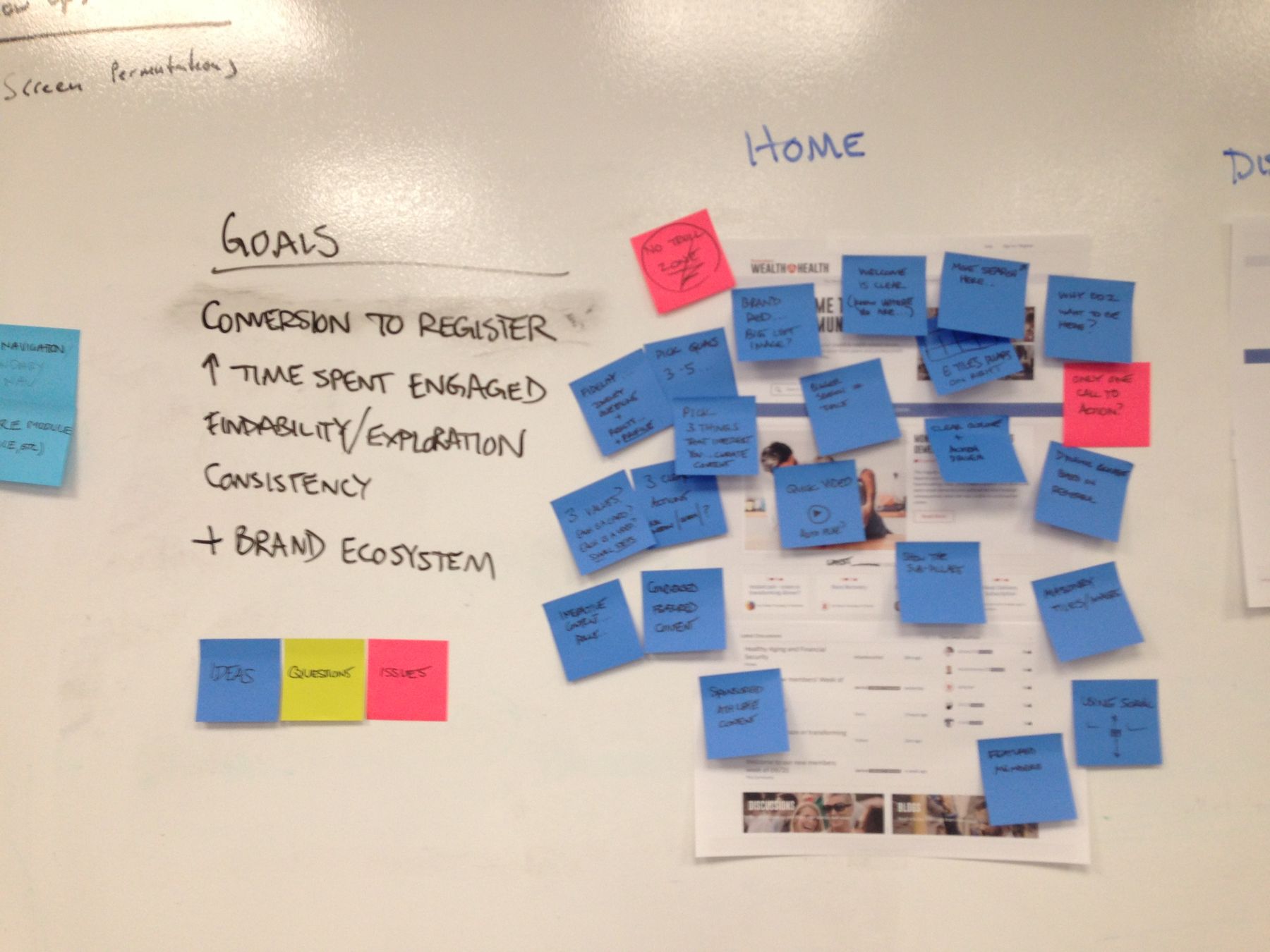
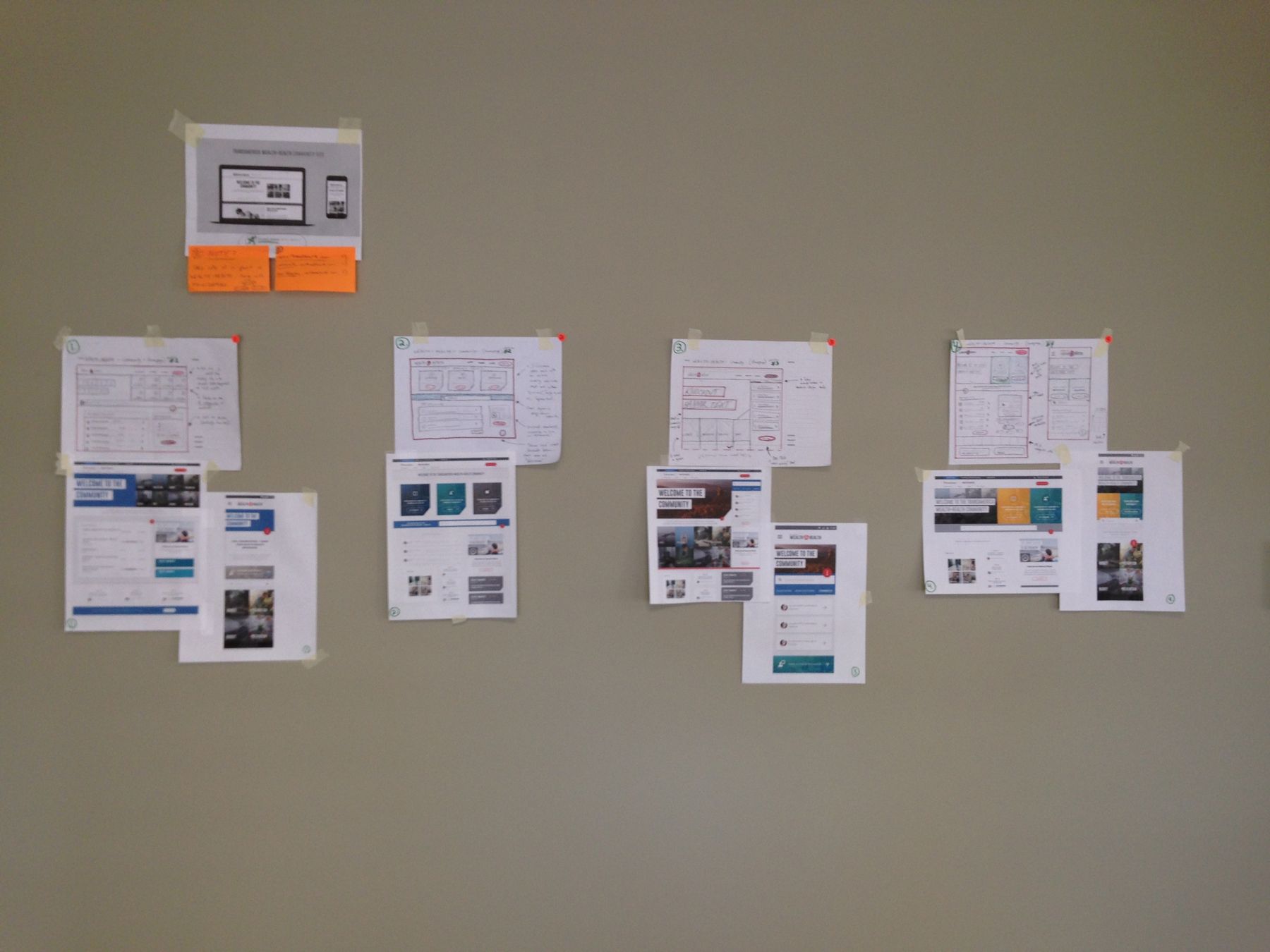
After a productive workshop, we took all of the design ideas generated by everyone during the session and consolidated them into 4 different layout approaches. For each, a hand-sketched draft was created and then digitally produced to show key differences in user experience, and also to display relevant components.
*Next steps include reviewing layouts with stakeholders, narrowing the concepts down to a single layout, and then developing a live version to work within the constraints of the CMS and existing content structures.
APPROACH #1 - 'POWER PILLAR'
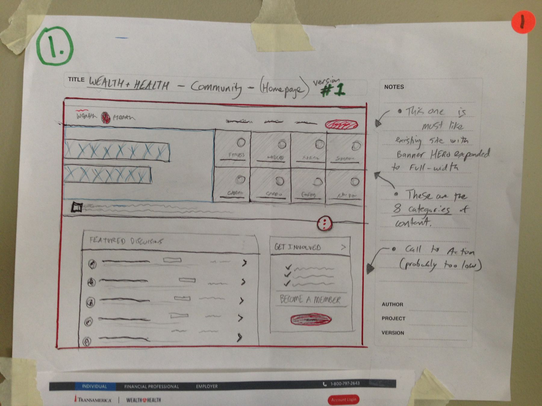
#1 - Power Pillar
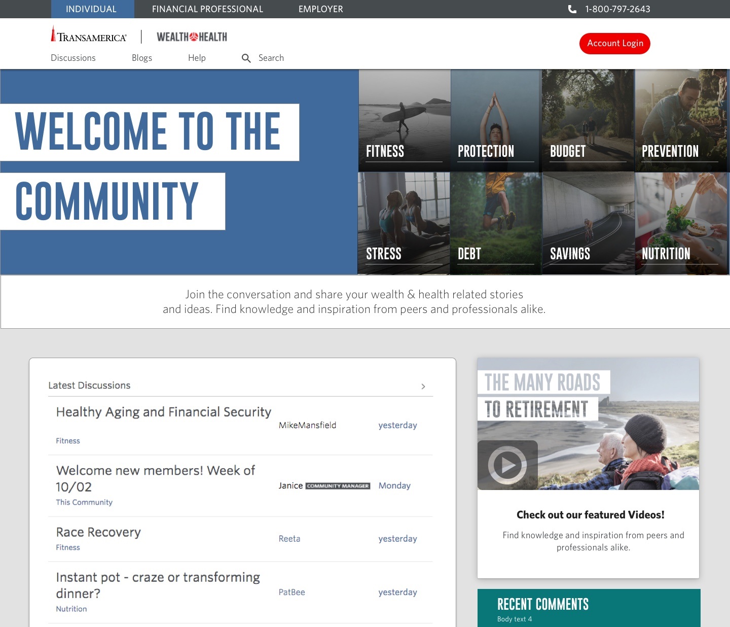
- The first of the four versions is a similar approach to the existing W+H Community homepage with a primary welcome Text area on the left, and 8-option grid of links on the right half.
- The differences include full-width layout applied to hero section, and various adjustments to content below top section.
- * Note, these designs are focused only on LAYOUT - the coloring/images/text is mostly all filler content. The next round of designs will use actual content*)

APPROACH #2 - Quick Start in 1, 2, 3 Columns
#2 - 3x Column CTA
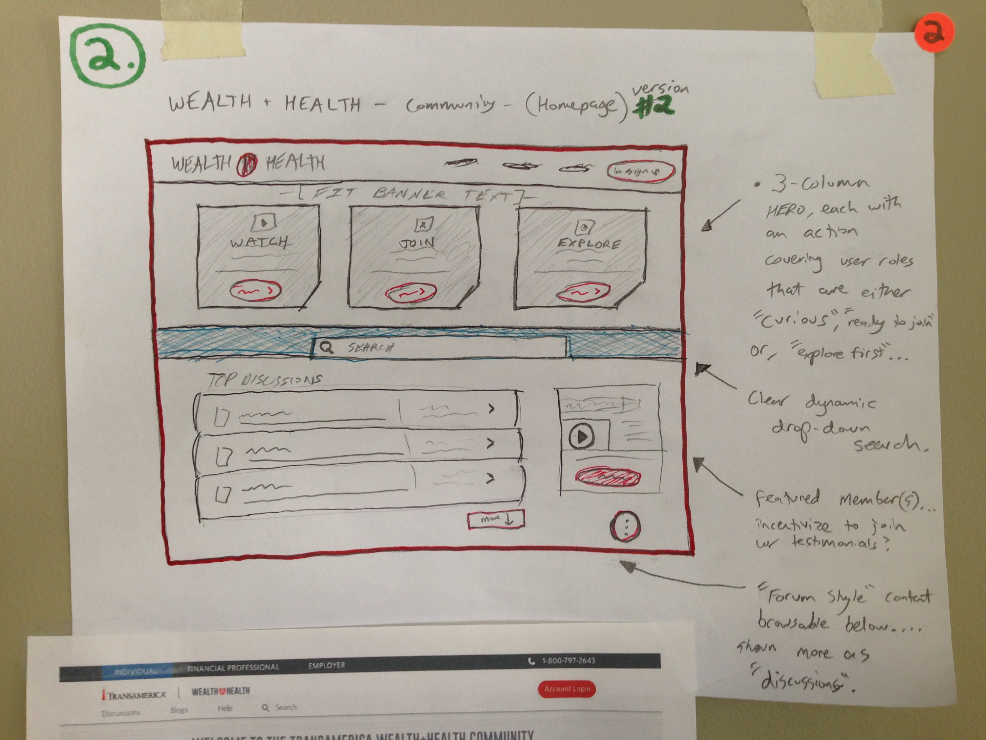
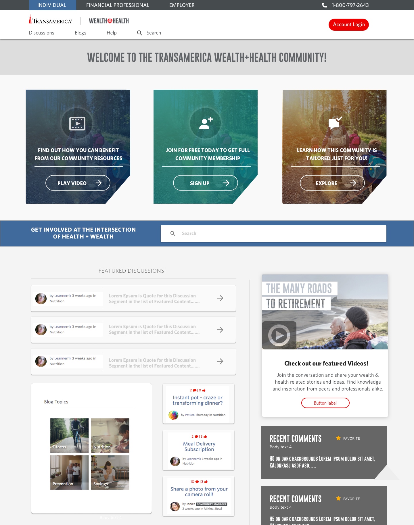
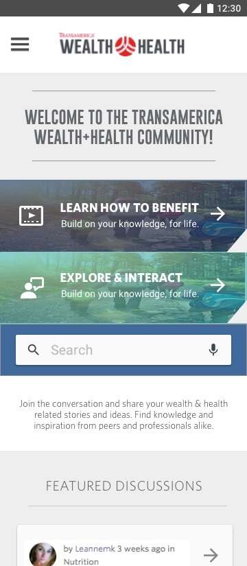
- This layout was originally sketched by a person in the workshop, and it's a great approach for encouraging the visitors to take action.
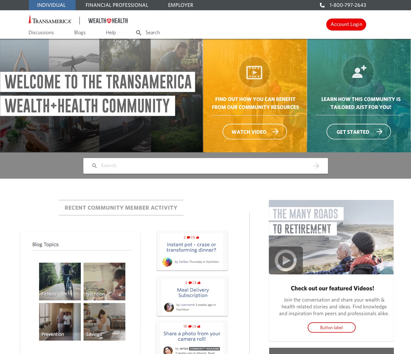
- The content 'above-the-fold' is broken down clearly into 3 columns, all of which consist of CTA sections. The 3 actions available in top section are: 'Watch' (intro video), 'Join', 'Explore'.
- Remaining lower sections on homepage would consist of featured content, filter-able discussions/comments, and more opportunities to take action and join/interact.
APPROACH #3 - 'Right Panel'
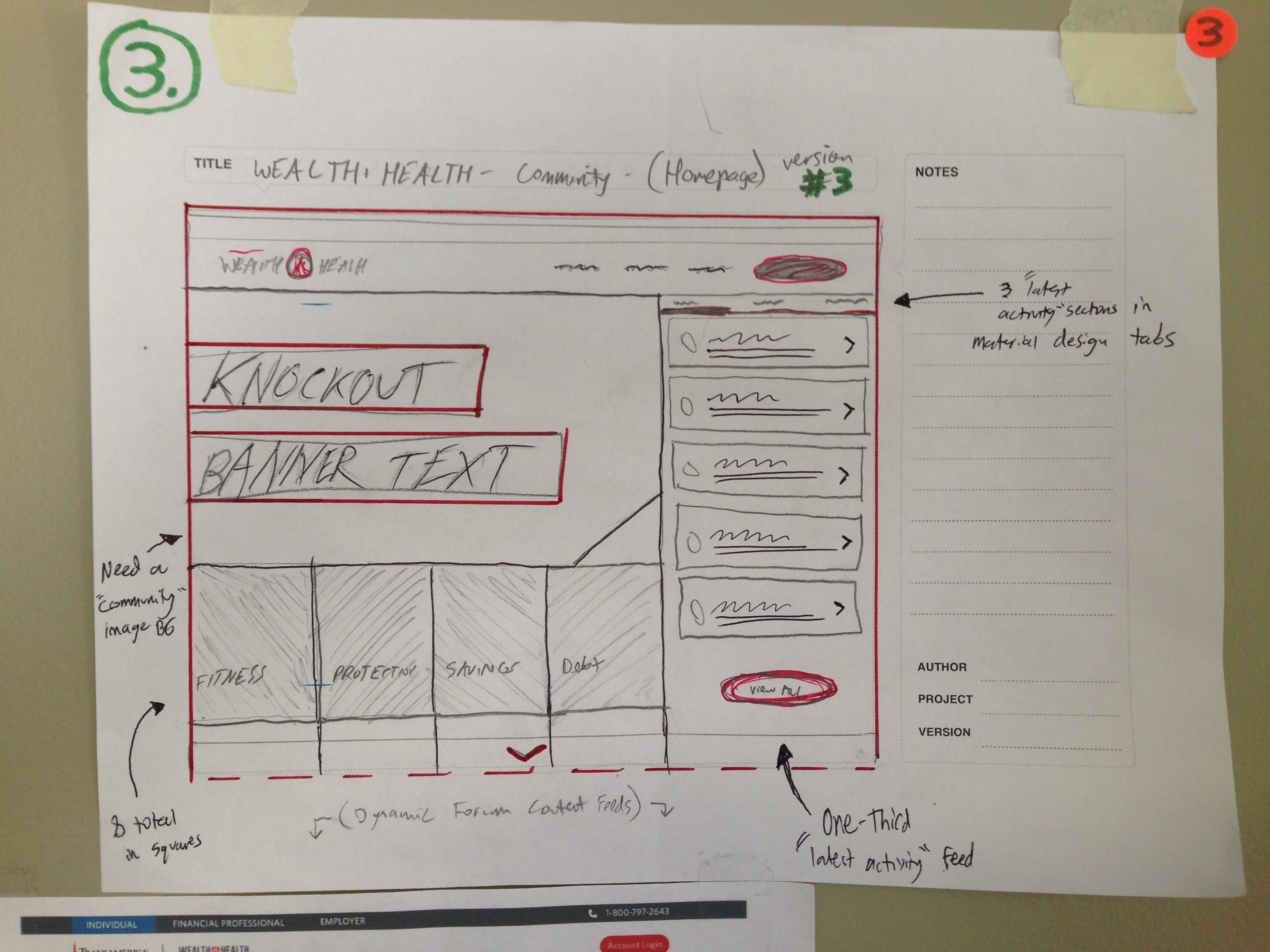
APPROACH #3
- This is a creative solution using a right-column to feature the latest comments (or 'discussions'), while still having the CTA & Banner Text sections to the left or directly below.
- As new visitors land on the page and consume the Hero-section content, they'll immediately have an idea of what the site is about, and likely be ready to explore more using the multiple options for navigation.
- This version of the homepage layout (#3) is very effective, although it might need some re-arranging and swapping of sections to fully optimize.
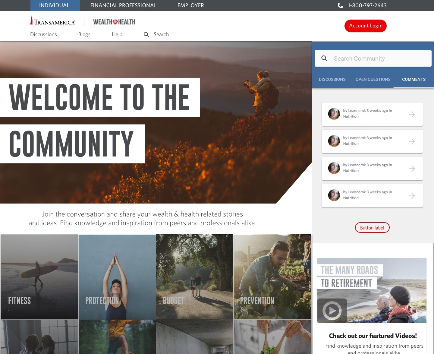
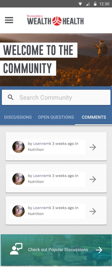
APPROACH #4 - Dual Action
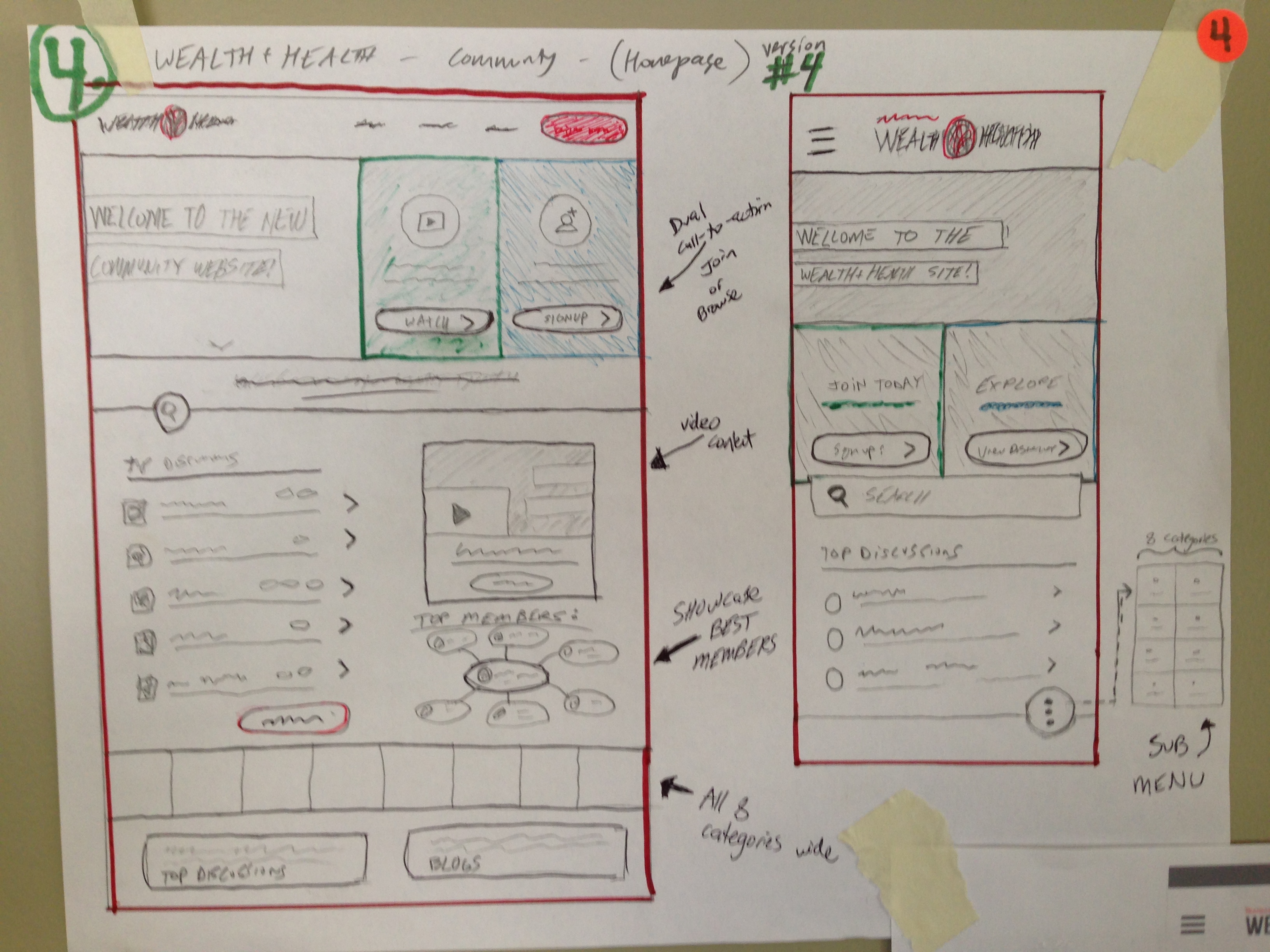
APPROACH #4 - Dual Action
- This one uses a combination of hero ideas with half of the top section as a Welcome-style knockout banner, and then the two right 1/4's are quick CTA's as discussed in many of the original sketches.
- The bottom portion of this version contains content sections found in the others, such as the video and recent comments components.
** ( This version received the most positive feedback so-far when previewed by members of the design team. Specifically, it fits many of the requirements discussed in the workshop, and offers a modern style to establish a positive first-impression with new site visitors.)
