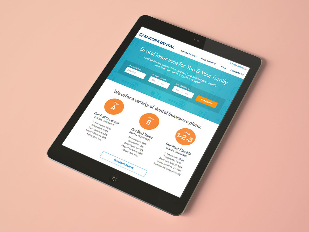
Encore Dental Insurance
Vision
To create a world class responsive web design experience for new and existing customers of State Farm. Content, usability and performance will be at the core for key deliverables, and will approach this project with mobile-first thinking. Will align the needs of the user with business goals and provide UX artifacts that will streamline development and deployment.
My Role
- Product Lead
- Strategy
- IA
- Ideation
- Interaction Design
- Design Direction
- Post Launch Analysis
- Mobile User Testing
Team Involved
- Encore Business Leads
- UX Designers x2
- Content Marketer
- SEO Specialist
- Content Strategist
- Analytics Manager
- Visual/Brand Designer
- Developers x2
Tools & Technology
- Google Consumer Surveys
- usertesting.com
- optimalworkshop.com
- mailchimp.com
- Ipevo Document Camera (IA)
- Omni-Graffle
- Axure
- Adobe Illustrator (Presentations)
- UX Recorder (Mobile Testing)
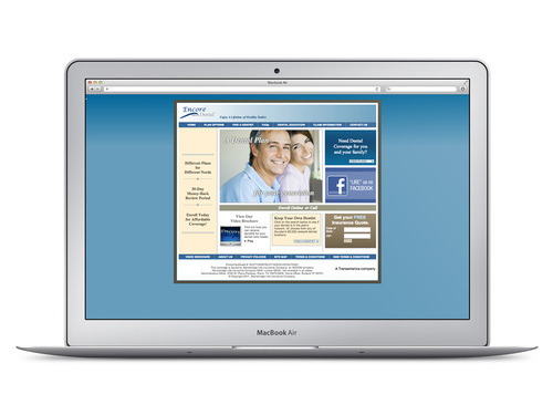
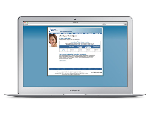
What was in place
Methodology
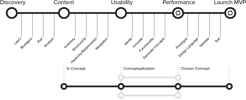
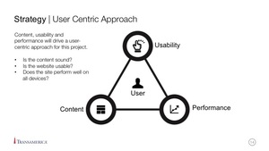
Below is a diagram of my approach to responsive design. I strongly believe that the three main drivers are content, usability and performance. Based on these three drivers, I created a lean approach that is currently being used for the project. It is extremely important that collaboration and communication with developers is apparent within this process from day one.
Process
Discovery
Kick Off Presentation
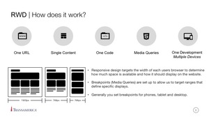
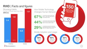
I believe that creating a presentation and presenting to the team and stakeholders gives them a sense of confidence that the project will be a success and that we are thinking about vision strategy and scope. Being the product owner I felt I needed to prove that I understand responsive web design. The presentation documented at a high level the what, the why and the how of what we were going to do. Again, this was a content first approach, that meant it was a new methodology for most in the team and the company as a whole. Below are some screens from the presentation.
Competitive analysis
Once we had created the vision for the project and we were in the planning stages I really wanted to understand what the competitive landscape was like and to get an idea of what it might take to gain a competitive edge via usability/UX. This was also an opportunity to create a competitive review that was a first in Transamerica for Dental Insurance.

Accessing our customers
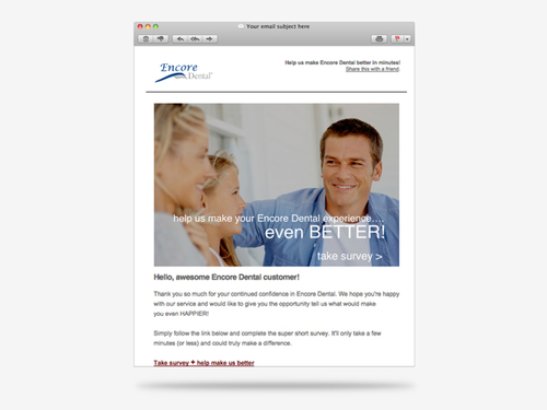
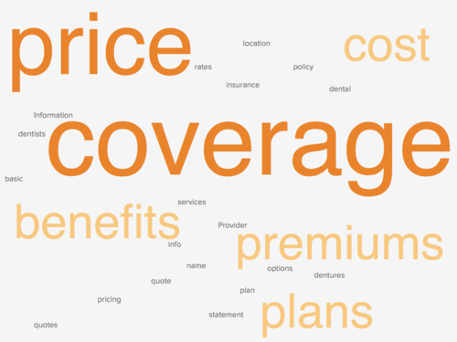
In a financial enterprise organization it can be tricky to access customers because of legal and security implications. However for this project we worked very hard to figure out a solution working with legal teams and key steak holders. We were able to gain access to over 100 hundred customers so utilizing mail chimp and survey monkey we were able to ask customers a few simple questions about their Encore Dental Experience. On top of that we held a small number of customer interviews conducted by our research team. The word cloud on the right represents all the feedback we received from both the steak holders, customers and potential customers. There was a clear indication that plan coverage, prices and benefits were high on the list so we needed to make sure that our experience catered to the needs of both the stake holders and our customers.
Content
Validating Information Architecture
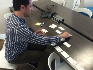
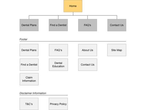
Myself, the key stakeholders, content strategist and SEO Manager worked together to create the site architecture. Having an SEO presence was extremely beneficial as we could optimize keyword search terms for page types. In order to validate our assumptions we also utilized Optimal Card Sort and conduct open card sorting activities to get external validation. From this we were able to move forward with a validated simple architecture.

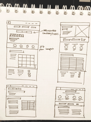
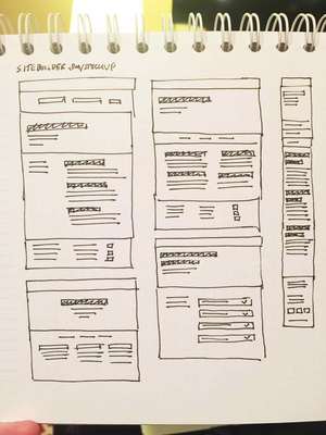
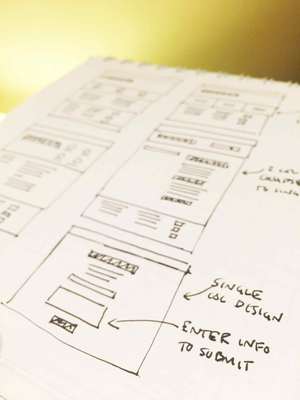
Quick Thumbnail Sketching
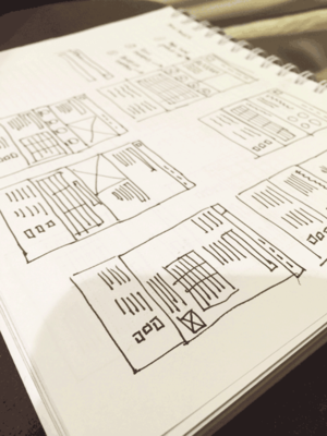
The quickest most effective way to mock up sites is buy sketching. Here are some screenshots of my layout ideas for some of the pages. As we were receiving content I was able to conceptualize how the content could potentially be laid out on the page for different views. Once I had an Idea of the layouts I would then translate them straight to Axure with the content.
Evolution of the Prototype
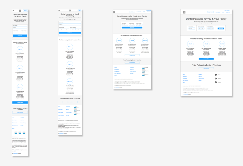
Below is a snapshot of how we built the prototype in Axure. This was technically used as the requirements document for development and the business leads.
This was extremely useful as we worked with development, we could quickly test assumptions and ideas before we would move forward and implemented the content, design or interaction.

Usability
Ideating the quote process
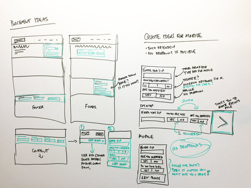
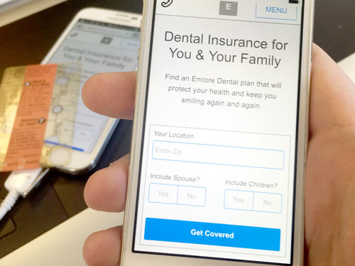
I really wanted to create a quote engine that was quick, intuitive, touch enabled and accessible. We originally had the idea or using steppers for the amount of children the user may have but after further insight it didn't matter so we then came up with the idea to use a toggle approach. This meant that we would be able to avoid dropdowns and make the quote tool even simpler. Once we had the concept we took it into Axure and tested the experience.
Mobile Testing (UX Recorder)
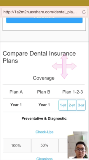
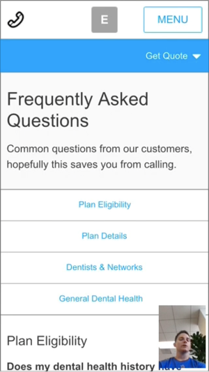
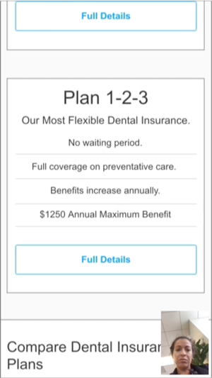
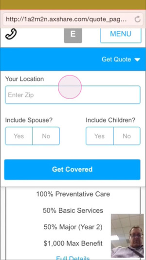
Because we built the different viewports in Axure we were able to load it in the Axure App and test the experience with users. This enabled us to learn from assumptions and make minor adjustments where needed. I set up a small number of testing sessions with tasks for he participants to go through. We used a tool called UX Recorder, which utilized the front facing camera to capture emotions and behaviors of the participant.
Feedback Friday (Usertesting.com)
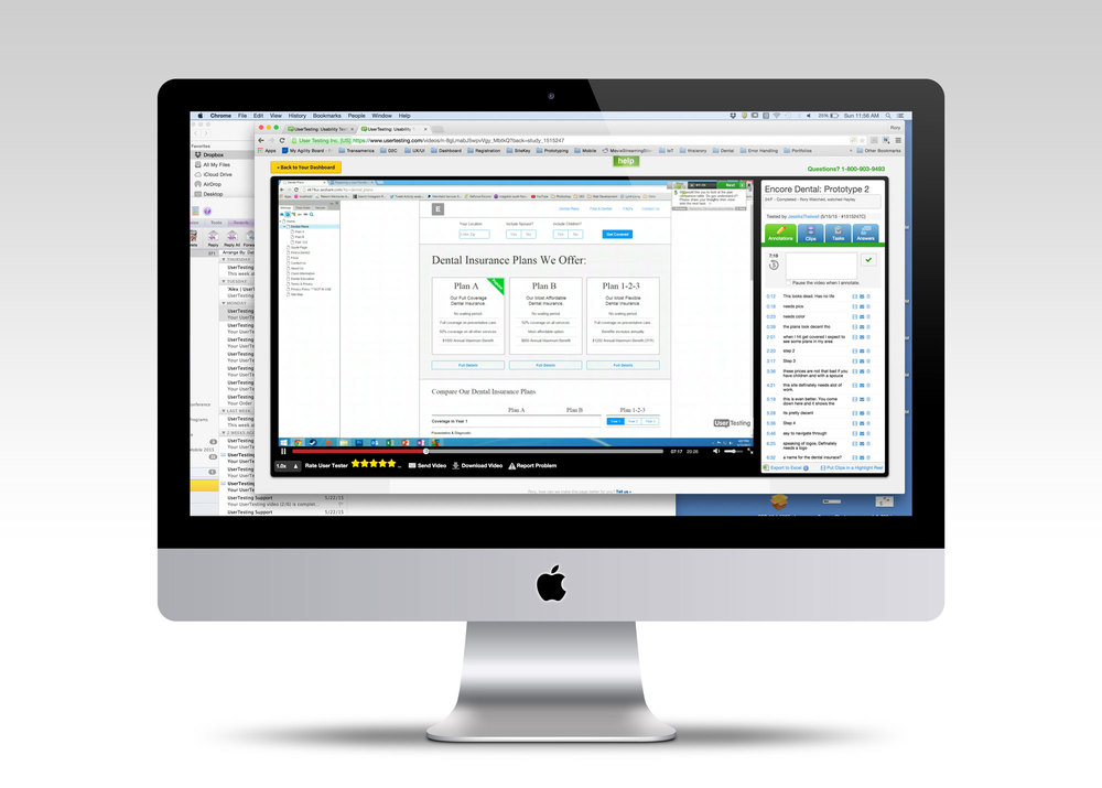
A key objective of mine for this project was to test early and test often whilst we were creating the experience so we would test the prototype on Friday and analyze the results on Monday. Make the necessary adjustments and continue to build out the site. This was a very successful technique.
The Prototype
This image shows screenshots of all four viewports that we built in Axure.
Performance
Design Experimentation
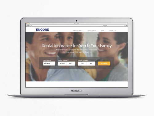
We tested variations of the landing page design with users to see which had a greater emotional connection. Users felt strongly about the design on the right as they felt they paid more attention to the content than the image. This also meant that the load speed of the site would be increased if we stuck to the design on the right so I made sure that this direction was followed through for the rest of the project.
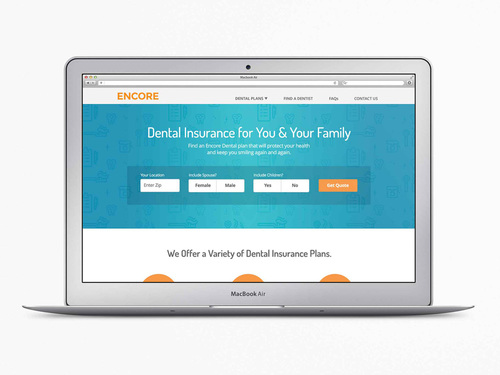
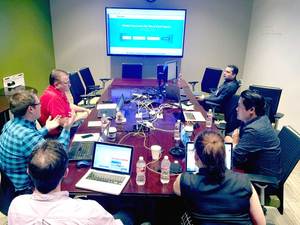
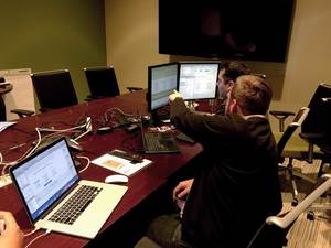
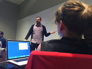
Development Workshop
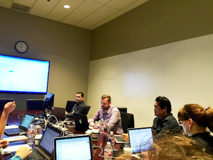
Working with key stakeholders, development, content and design for a 3 day workshop.
Contextual background patterns
An early idea of mine when we were conceptualizing the pattern background design was to change the icons depending on the page to add more contextual value to the page. It was a small thing but we felt it was a nice touch to the overall look and feel.

Launch MVP
Final Designs
What we launched was a content optimized, usable and performance responsive dental insurance website.
